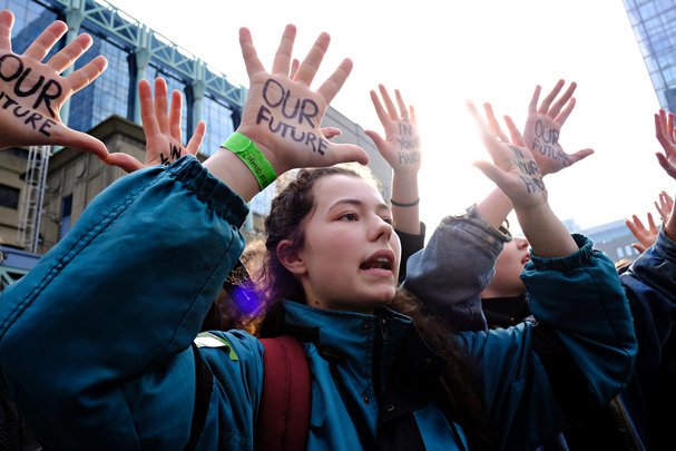
Belgian high school and university students stage a protest against the climate policies of the government.
Credit: Alexandros Michailidis/Shutterstock
These striking animations show the real impacts of climate change
Visualizing a grim outlook.
24 September 2019

Alexandros Michailidis/Shutterstock
Belgian high school and university students stage a protest against the climate policies of the government.
Most of us will never witness melting glaciers and flooded coastlines first-hand, but we can all see that it’s getting hot, and fast.
According to the 2018 Intergovernmental Panel on Climate Change Special Report on Global Warming, human activities have increased Earth’s global average temperature by about 1 degree Celsius since the pre-industrial period, and we are already feeling the effects, including more frequent extreme weather events and sea level rise.
As the world came together last week to protest climate change inaction, some really clever visualizations made the rounds on social media. Here are our favourites:
Sea level rise since 1880
Sea level rise 1880 - 2017#GlobalWarming #ClimateChange pic.twitter.com/0r7V2xgjB7
— ⚫️ Kevin Pluck (@kevpluck) October 6, 2018
The world’s ice sheets and glaciers are melting at an alarming rate, with small island nations and coastal regions set to pay the biggest price.
This simple but striking visualization shows how this side-effect of climate change has played out over 137 years. Created by Kevin Pluck of Pixel Movers and Makers, it’s based on sea level rise data from Australia’s national science institute, the CSIRO, and NASA’s GISS Earth sciences division.
Each horizontal ‘wave’ shows measurements for each year from January to December, with sea levels rising by more than 22 centimetres since 1880.
Originally shared on Reddit in 2018, the visualization has attracted around 1,500 comments. As one Reddit user said, “Waterworld doesn’t seem too illogical a theory now”.
Changes in Earth’s surface temperature distribution
Animation showing how the distribution over Earth's surface of annual average temperature anomalies has been shifting due to global warming since 1850.#GlobalWarming #ClimateChange pic.twitter.com/HNUmJaZS2l
— Robert Rohde (@RARohde) March 29, 2019
Since 1880, average global temperatures have increased by around 0.8 degrees Celsius, with two-thirds of the warming occurring since 1975. But as this visualization shows, this upwards trend has seen both peaks and troughs.
Robert Rohde, lead scientist at Berkeley Earth, a California-based non-profit focused on land temperature data analysis for climate science, visualized how the distribution of global 12-month temperature anomalies have evolved since 1850. These anomalies are measured against averages from 1951 to 1980.
The wild fluctuations pick up the pace after 1980, with the distribution skewing to the right by 2018.
Real-time speed of global fossil fuel CO2 emissions
Real-time speed of global fossil fuel CO₂ emissions (each box is 10 tonnes of CO₂).
— Randy Olson (@randal_olson) September 17, 2019
Jaw-dropping #dataviz by @neilrkaye.https://t.co/6s6SIGwJ9g pic.twitter.com/jRMxYs4ev7
It’s no secret that global fossil fuel emissions have been increasing over the past century, but what does this look like in real-time?
In just ten seconds, climate data scientist, Neil Kaye, at the United Kingdom’s Met Office has shown how rapidly global emissions have increased since 1800. Each stacked box represents ten tonnes of carbon dioxide.
While the carbon dioxide emissions grew at a relatively slow pace at the beginning of the century, they reached record-breaking speeds by the turn of the millennium, reaching 37,100 million tonnes in 2018.
Temperature anomalies by country
This animation shows the average, maximum, and minimum temperature anomalies for each state in the United States. It’s alarming! (Created by Antti Lipponen, @anttilip) #Climate pic.twitter.com/0FTLy5QGCp
— Climate Reality (@ClimateReality) May 29, 2019
Tweeted earlier this year, but now more relevant than ever, these animated circles transform climate data visualization into pop art.
Created by Antti Lipponen, a research scientist at the Finnish Meterological Institute, it uses a series of circles to show how much annual temperatures deviated from the average in different countries over 137 years.
Before the 1970s, the majority of the circles show flashes of pale blue and orange, indicating relatively small variations in annual temperatures. But by the 1990s, it’s clear that temperatures are swinging well above average, with each country circle pulsating in dark reds and oranges.
“No matter how you visualize this data, it looks scary, especially the years 1980 to present day,” Lipponen told Gizmodo’s Earther. “Unfortunately, these bubbles won’t break when they grow too large.”
Read next:
This morbid simulation reveals how people tend to die